London Met has a range of colours in its palette that reflects the diverse and colourful University and city that we work and live in.
It's important that you consider accessibility when choosing colour combinations, so please ensure you've read the guidance on accessible colour combinations below.
Parent colours
Our parent colours are black and white and our logo always appears in one or other of these colours. To achieve vibrancy in your design work, you can place the logo on a coloured background.
| Colour | Pantone | CMYK value | RGB value | Hex code | RAL code |
|---|---|---|---|---|---|
| PMS Black | 0 0 0 100 | 35 31 32 | #231f20 | RAL 8022 | |
| White | 0 0 0 0 | 0 0 0 | #ffffff | RAL 9016 |
Secondary colours
It is possible to choose any colour from the palette for your design work. You may find that some colours work better for certain audiences, events or projects.
Please remember that our logo must always appear in black or white only. It must never be coloured. We no longer use purple as our main brand colour and use of this should be kept to a minimum.
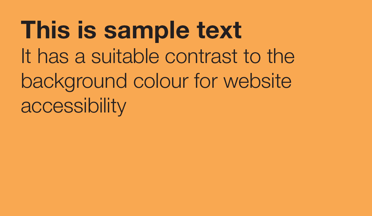
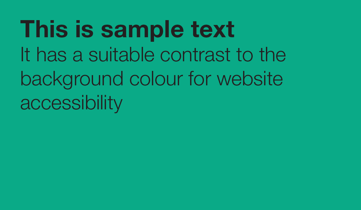
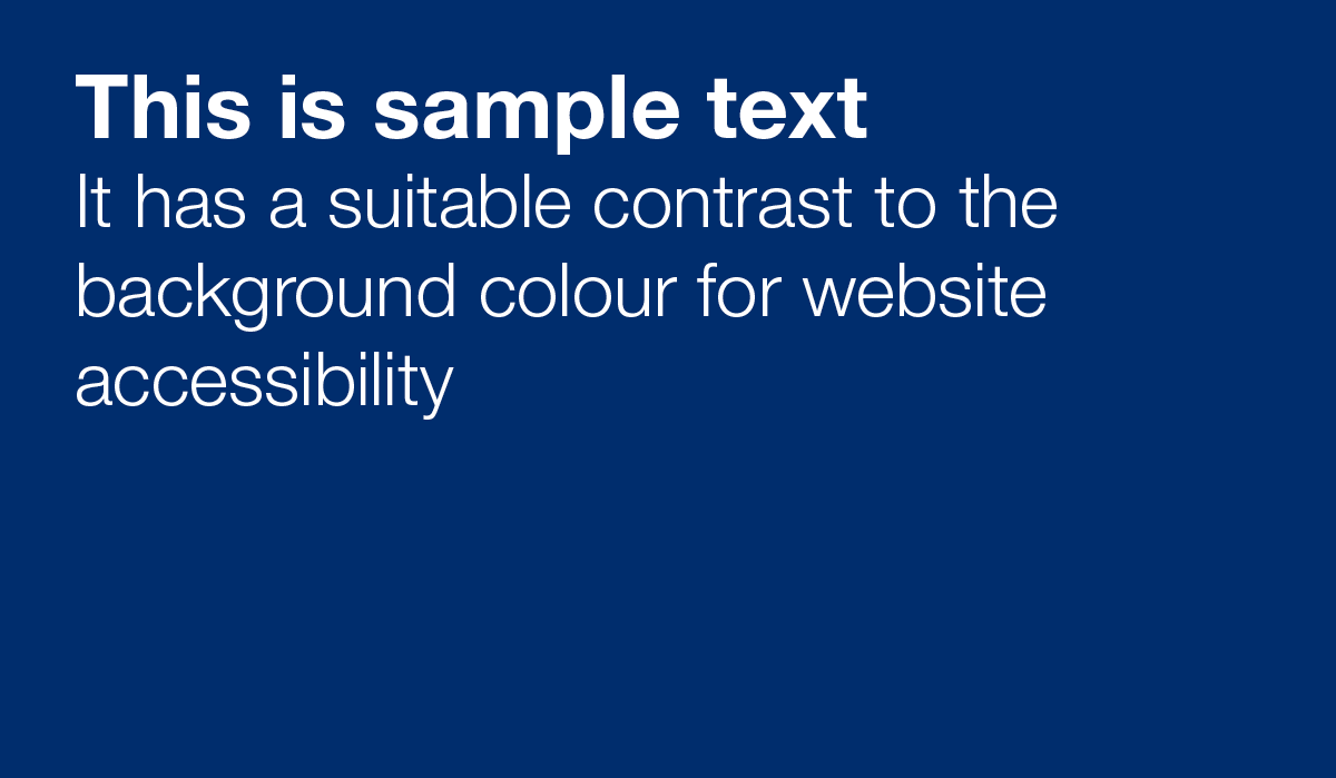
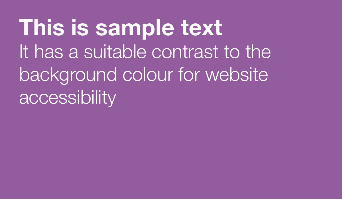
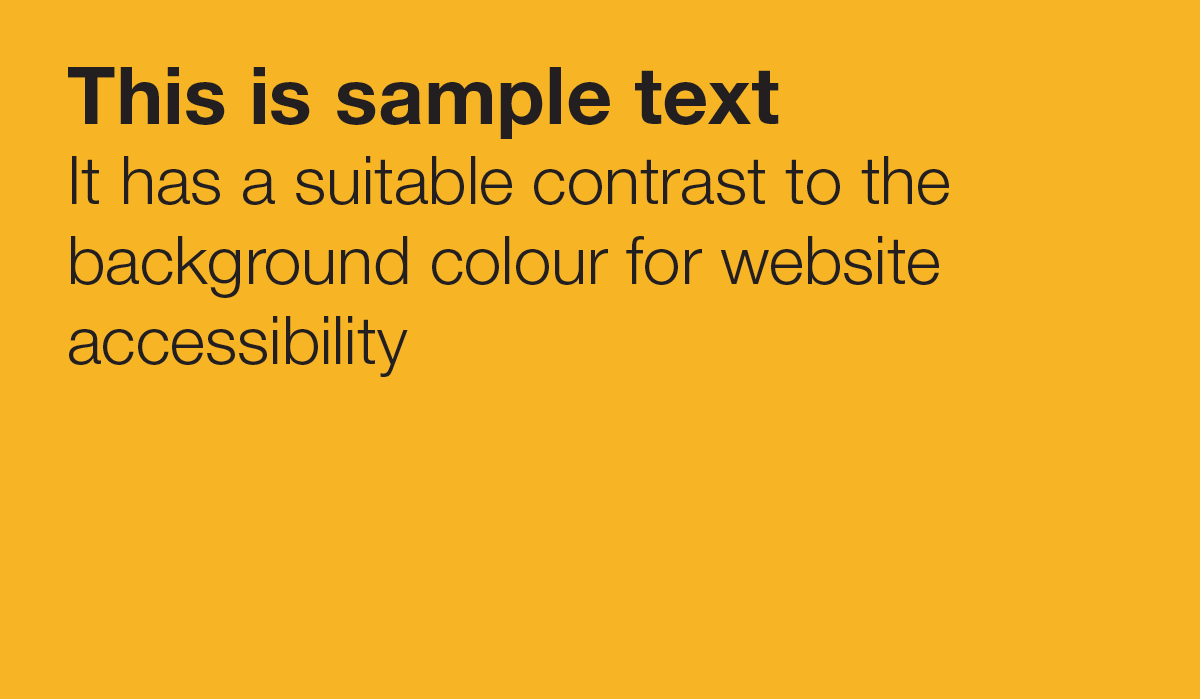
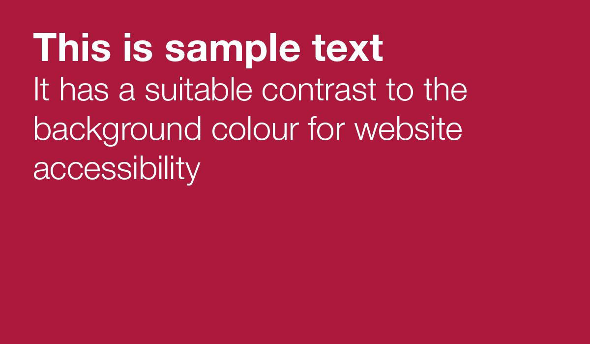
Your colour combinations must be accessible and allow for any text to be easily read when used in combination with a background colour. To ensure you're using an accessible colour combination (this is particularly important for any digital content you produce, eg digital documents, web content, emails etc), please use one of the colour combinations below. The main colour can be used either as the background colour or the text colour but must be used in combination with its partner colour. For example, if using colour PMS 136, black rather than white text must be used in order to meet web accessibility regulations.
| Colour | Pantone | CMYK value | RGB value | Hex code | RAL code | Partner colour |
|---|---|---|---|---|---|---|
| PMS 136 | 0 39 77 0 | 255 154 50 | #f9a851 | RAL 1017 | Black | |
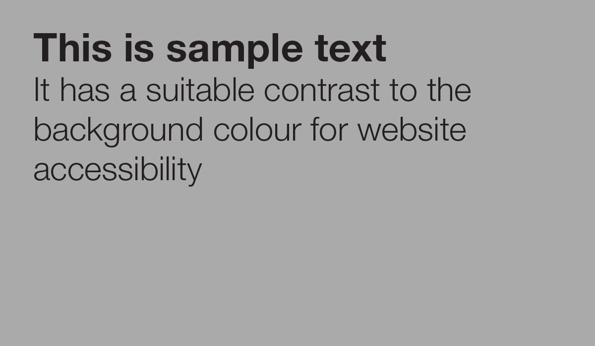
| PMS Cool Grey 4 | 27 22 21 0 | 171 170 171 | #b8b8b9 | RAL 7047 | Black | |
| PMS 2593 | 48 74 6 0 | 125 72 143 | #925c9e | RAL 4008 | White | |
| PMS 179 | 5 77 68 0 | 216 72 65 | #e55f53 | RAL 2012 | Black | |
| PMS Green | 100 0 65 0 | 0 154 114 | #0aaa87 | RAL 6033 | Black | |
| PMS 306 | 81 3 5 0 | 0 164 221 | #00aee0 | RAL 5024 | Black | |
| PMS Yellow 012 | 2 12 100 0 | 251 207 0 | #fcd804 | RAL 1016 | Black | |
| PMS 294 | 100 86 29 22 | 0 34 91 | #002d6d | RAL 5002 | White | |
| PMS 1945 | 23 100 73 13 | 151 10 47 | #ac193c | RAL 3027 | White | |
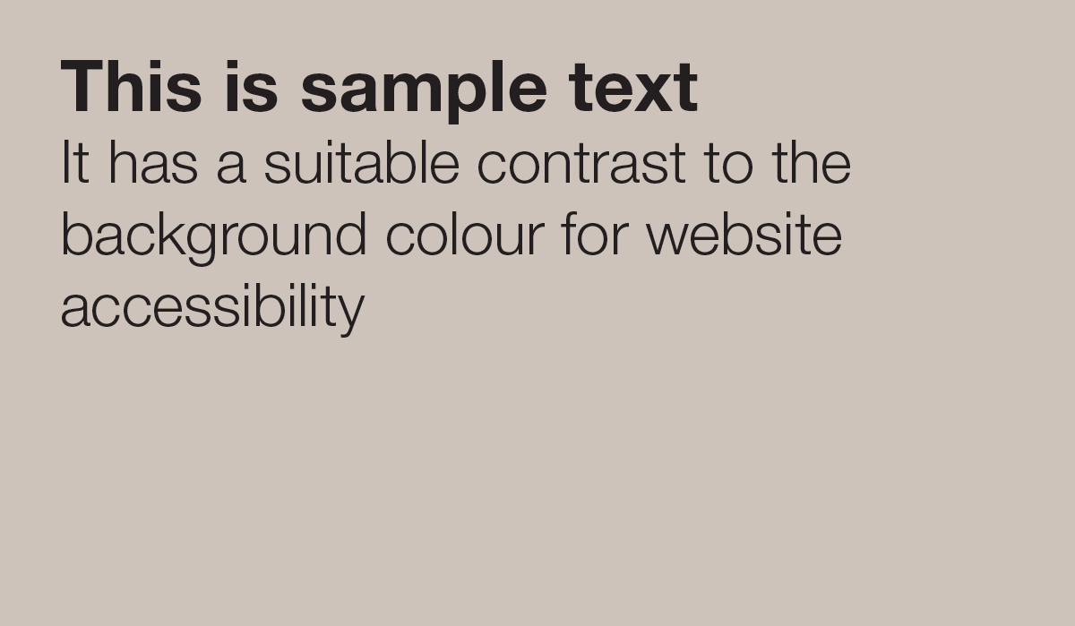
| PMS Warm Grey 2 | 20 20 23 0 | 193 182 172 | #cdc3ba | RAL 7047 | Black | |
| PMS 283 | 39 14 0 0 | 134 179 226 | #93bfe9 | RAL 5024 | Black | |
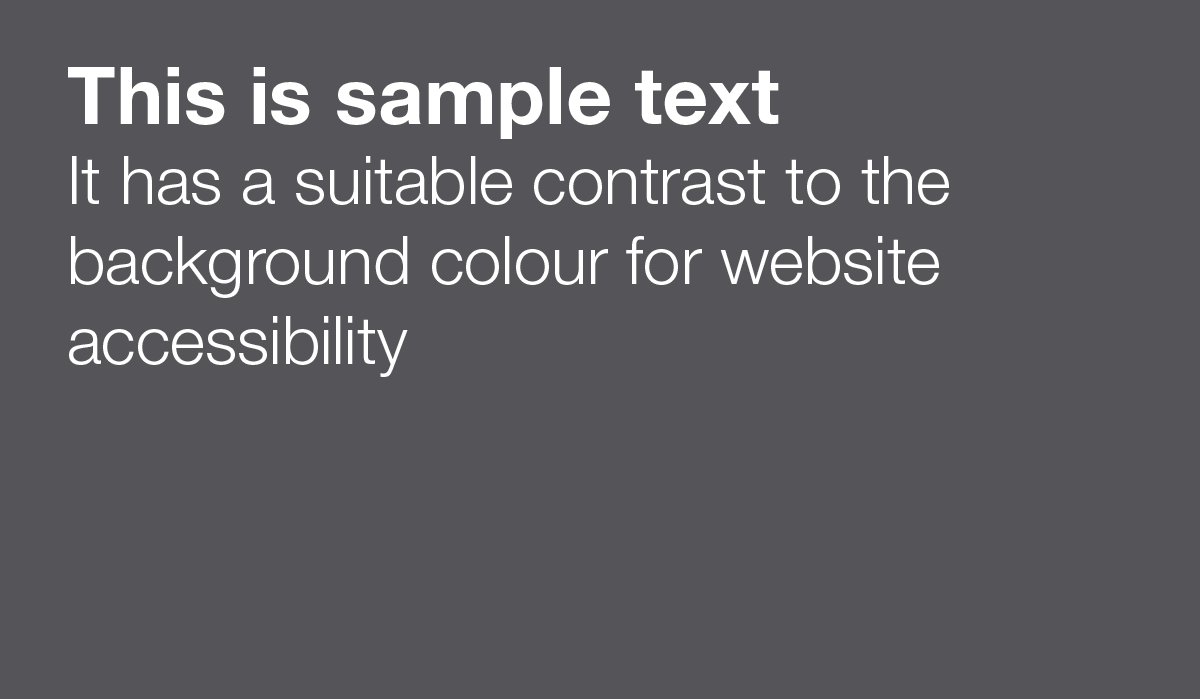
| PMS Cool Grey 11 | 65 57 52 29 | 68 68 72 | #555559 | RAL 7015 | White | |
| PMS 178 | 0 78 59 0 | 237 86 86 | #ed5656 | - | Black |
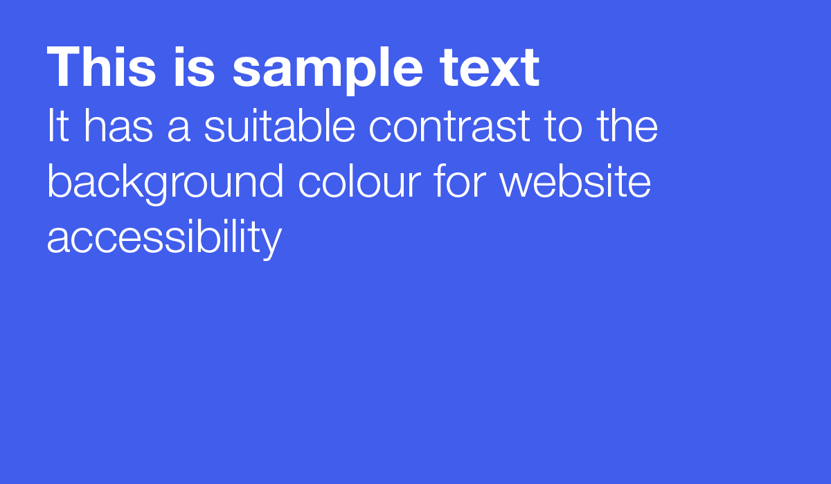
The additional colours below and available for use digitally – both colours should be used in combination with white:
| Colour | Hex code |
|---|---|
| #415dec | |
| #067f7c |
Colours and accessibility
It is important you think carefully about what colours you use. Some colour combinations prove problematic for those with colour vision deficiencies. Web accessibility regulations also require specific contrast ratios between a foreground colour and a background colour online, so follow these rules to ensure your colour combinations are accessible:
- Avoid green/red, blue/purple and light green/yellow.
- Avoid using colour alone to convey meaning – for example, don’t signpost by saying “click on the green button” (not everyone will know it is green) and consider using alternative design elements to aid meaning. For example, a line graph using a combination of lines comprised of dots, dashes, squares etc, which don’t rely on colour-coding, will ensure those with colour vision deficiencies can still interpret the information in the graph.
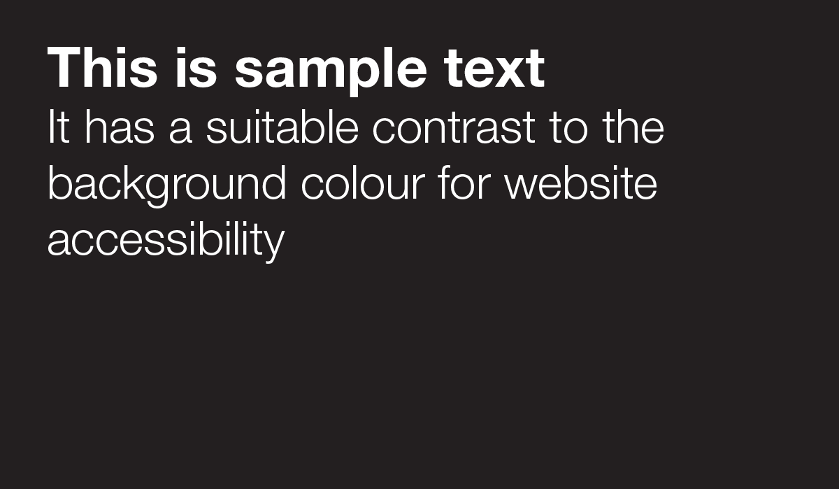
- Ensure there is an appropriate contrast between your background and foreground colour. The contrast ratio must be at these 4.5/1 for digital content. To ensure you’re using an appropriate contrast ratio, use one of the colour combinations provided on this page. If you want to use a combination not included on this page, please ensure it still adheres to our brand guidelines and to the colour contrast ratios stated here – the WebAIM contrast checker can help you do this. Please note, link text, eg where words are hyperlinked mid-sentence, should also have 3:1 contrast to the colour of the surrounding text.
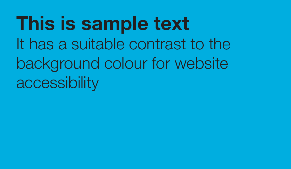
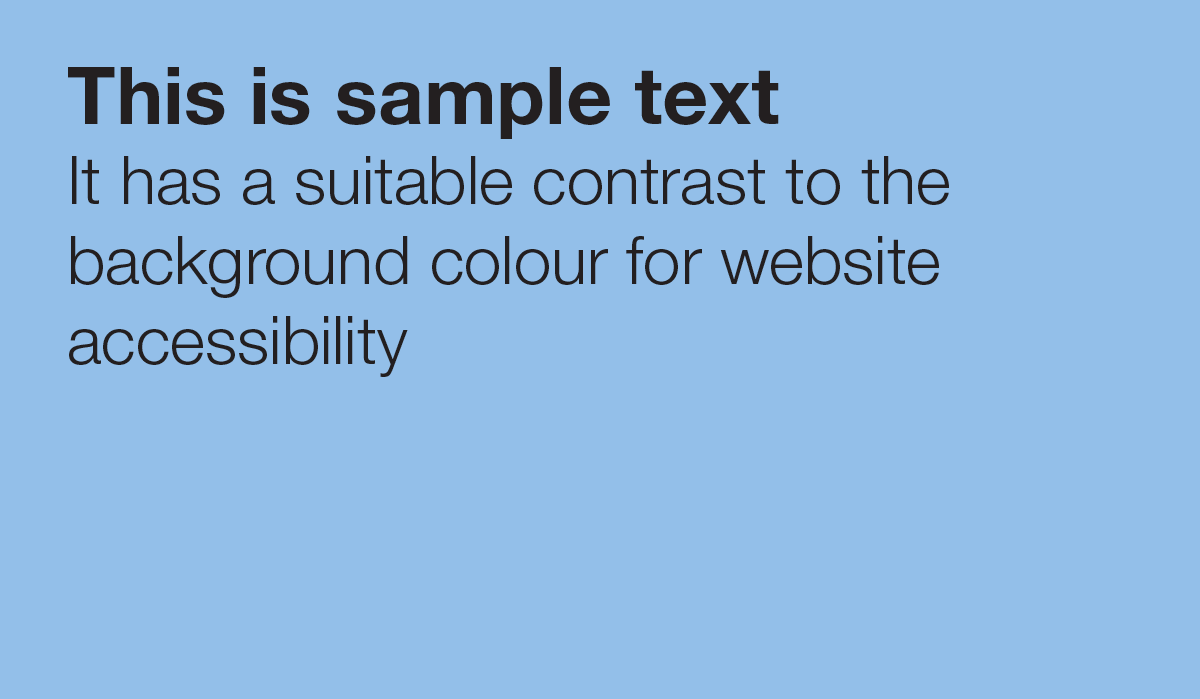
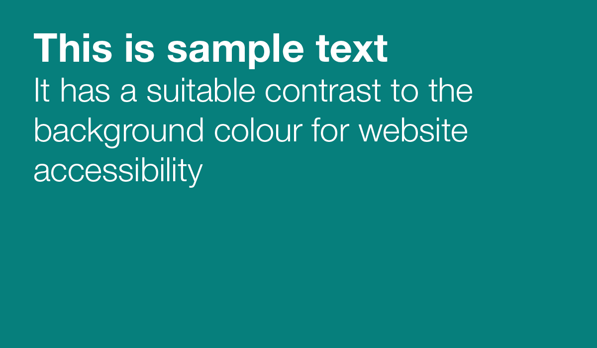
Examples or suitable colour contrast
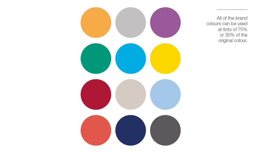
Tints
You can also use the colour palette at 30% or 70% opacity to allow for greater flexibility in your design.
| Colour | Pantone | CMYK value | RGB value | Hex code | RAL code | Partner colour |
|---|---|---|---|---|---|---|
| PMS 136 @ 70% | 0 27 54 0 | 253 193 129 | #fdc182 | RAL 1017 | Black | |
| PMS Cool Grey 4 @ 70% | 18 14 14 0 | 207 206 207 | #cfcefc | RAL 7047 | Black | |
| PMS 2593 @ 70% | 29 45 4 0 | 181 147 189 | #b593bd | RAL 4009 | Black | |
| PMS 179 @ 70% | 3 51 35 0 | 238 147 141 | #ee938d | RAL 3015 | Black | |
| PMS Green @ 70% | 58 3 430 | 106 190 165 | #6abea5 | RAL 6027 | Black | |
| PMS 306 @ 70% | 53 6 2 0 | 105 194 233 | #69c2e9 | RAL 1016 | Black | |
| PMS Yellow 012 @ 70% | 2 7 70 0 | 252 226 107 | #fce26b | RAL 1016 | Black | |
| PMS 294 @ 70% | 69 50 22 2 | 94 119 156 | #5e779c | RAL 5014 | White | |
| PMS 1945 @ 70% | 20 74 32 1 | 200 100 128 | #c86480 | RAL 4003 | White or black* | |
| PMS Warm Grey 2 @ 70% | 12 12 15 0 | 221 214 208 | #ddd6d0 | RAL 9002 | Black | |
| PMS 283 @ 70% | 26 9 0 0 | 182 211 240 | #b6d3f0 | RAL 7047 | Black | |
| PMS Cool Grey 11 @ 70% | 50 42 40 5 | 133 133 136 | #858588 | RAL 9022 | White or black* | |
| PMS 136 @ 30% | 0 12 23 0 | 255 226 195 | #ffe2c3 | RAL 1015 | Black | |
| PMS Cool Grey 4 @ 30% | 7 5 5 0 | 234 234 234 | #eaeaea | RAL 9003 | Black | |
| PMS 2593 @ 30% | 10 16 2 0 | 224 210 227 | #e0d2e3 | RAL 7047 | Black | |
| PMS 179 @ 30% | 1 20 11 0 | 248 210 208 | #f8d2d0 | RAL 3015 | Black | |
| PMS Green @ 30% | 25 1 18 0 | 191 224 212 | #bfe0d4 | RAL 6019 | Black | |
| PMS 306 @ 30% | 23 2 1 0 | 192 226 245 | #c0e2f5 | RAL 7047 | Black | |
| PMS Yellow @ 30% | 1 2 30 0 | 254 242 190 | #fef2be | RAL 1015 | Black | |
| PMS 294 @ 30% | 24 16 9 0 | 191 200 214 | #bfc8d6 | RAL 7047 | Black | |
| PMS 1945 @ 30% | 7 27 10 0 | 232 193 203 | #e8c1cb | RAL 3015 | Black | |
| PMS Warm Grey 2 @ 30% | 5 5 5 0 | 240 237 235 | #f0edeb | RAL 160-3 | Black | |
| PMS 283 @ 30% | 10 3 0 0 | 224 236 248 | #e0ecf8 | RAL 9003 | Black | |
| PMS Cool Grey 11 @ 30% | 20 17 17 0 | 203 200 200 | #cbc8c8 | RAL 7047 | Black |
*Please note, these colour combinations, when used for text and a background, are only suitable if using large bold text (at least 14pt or 19 pixels). Please avoid this colour combination for normal text.