We hope for each Staff Network to have its own vibrant look while staying unmistakably part of London Met. By building on the University’s core Cosmos logo, you’ll be able to create simple, distinct, consistent materials. The result: strong visual consistency, better recognition, and quicker roll-out across web, social, and promotional channels.
Need Help?
If you have questions about logo creation, colour choices, or applying the brand across different platforms, contact Marketing for guidance and templates.
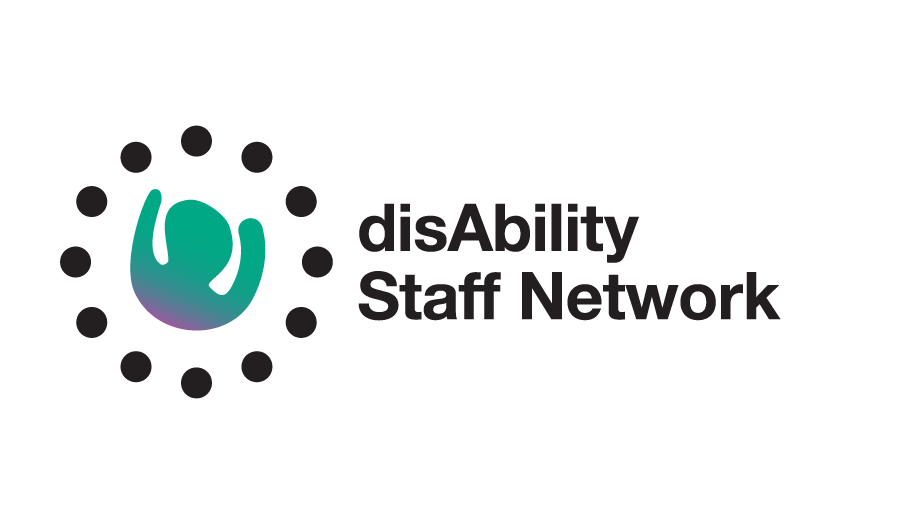
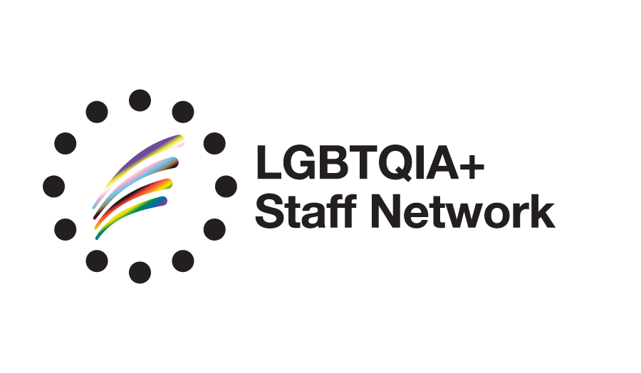
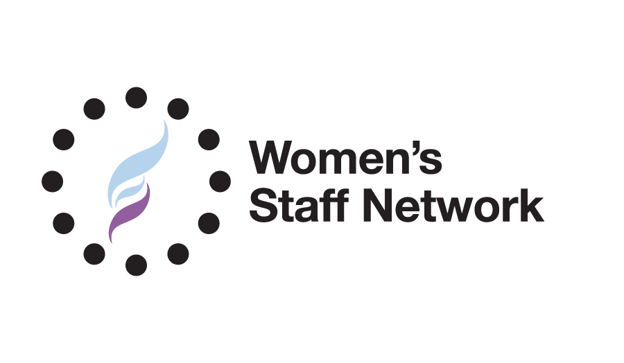
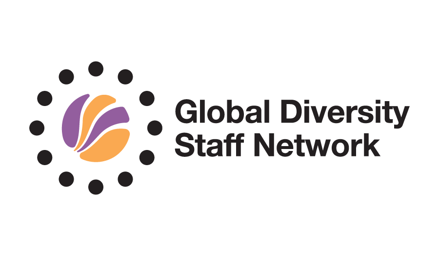
Our current staff networks
Core motif
- Shape: Use the inner ring of the London Met Cosmos logo as the base.
- Size: Keep the outer diameter at 250px (1:1 scale). Add outer circles measuring 25px in diameter.
- Spacing: Allow for a 25px clear area around the entire motif to prevent visual clutter.
Central icon
Add a simple graphic or motif in the centre of the ring.
- Style: Keep the icon minimal and flat for clarity at small sizes. Start by designing in black, then add colour later.
- Line weight: Use strokes of 10–12px – equal to or slightly lighter than the ring outline.
- Clear space: Maintain a 12px margin around the central motif and 25px around the outer circles to avoid clutter.
Colour palette
- Primary colour: Select one bold colour from the brand palette.
- Secondary colour: Use a 70% or 30% tint of the primary colour.
- Usage: Colours may be applied as solid fills or gradients, depending on the desired effect.
Typography
Keep text to the network name only.
- Font: Use Helvetica Neue Bold. If unavailable, Arial Bold is an acceptable substitute. More information can be found without our font guidelines.
- Size: Set at 32pt
- Spacing: Leave a 30px gap between the ring and the first letter of your network name.