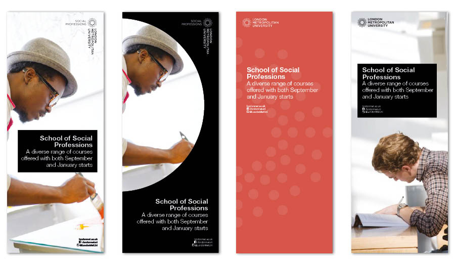
The image above indicates how our banners look.
If you are considering producing a banner, first read about the print and design process and then either:
- Commission a poster by completing the design request form
- Use a template (if you are a graphic designer) and then send it to Marketing or PR for approval
Note that where banners are created for wayfinding purposes, the Estates department must be consulted.
Copy guidance
Please consider that on most standard banners there isn't room for more than about 20 words (not including website URLs and social media handles).

All materials produced by or for the University must:
- Display, on the front, the University logo or that of a recognised sub-brand
- Adhere to the logo sizing and positioning guidance
- Use the correct icons and maps
- Only use colours from our colour palette
- Use the corporate font
- Be written in the style set out in our editorial style guide
- Only use images that comply with the photography guidance
- Apply the principles of good design
Built into each section of our brand guidelines is the flexibility to allow for creativity and vibrancy. We have developed a set of templates for staff with graphic design skills to use to put together frequently produced items. Please read the brand guidelines before you start designing to ensure that your work is consistent with all of our other communications. The graphic designers the Marketing team uses also enjoy creative freedom when it comes to creating eye-catching materials but will always adhere to our guidelines.
Any design concept may be considered, as long as the guidelines and the design and production processes (including the requirements for approval from Marketing or PR) are followed.
